
Goodbye White Walls, Hello, Moody Coastal Blue
Should we, shouldn’t we? This is the doubt-inducing question that every interior enthusiast asks themselves before making what many would consider a ‘risky’ design choice. In our case, the decision to colour-drench our open-plan living/kitchen/dining space in a gorgeous, moody, deep, blue-green took two years of ohh-and-umming.
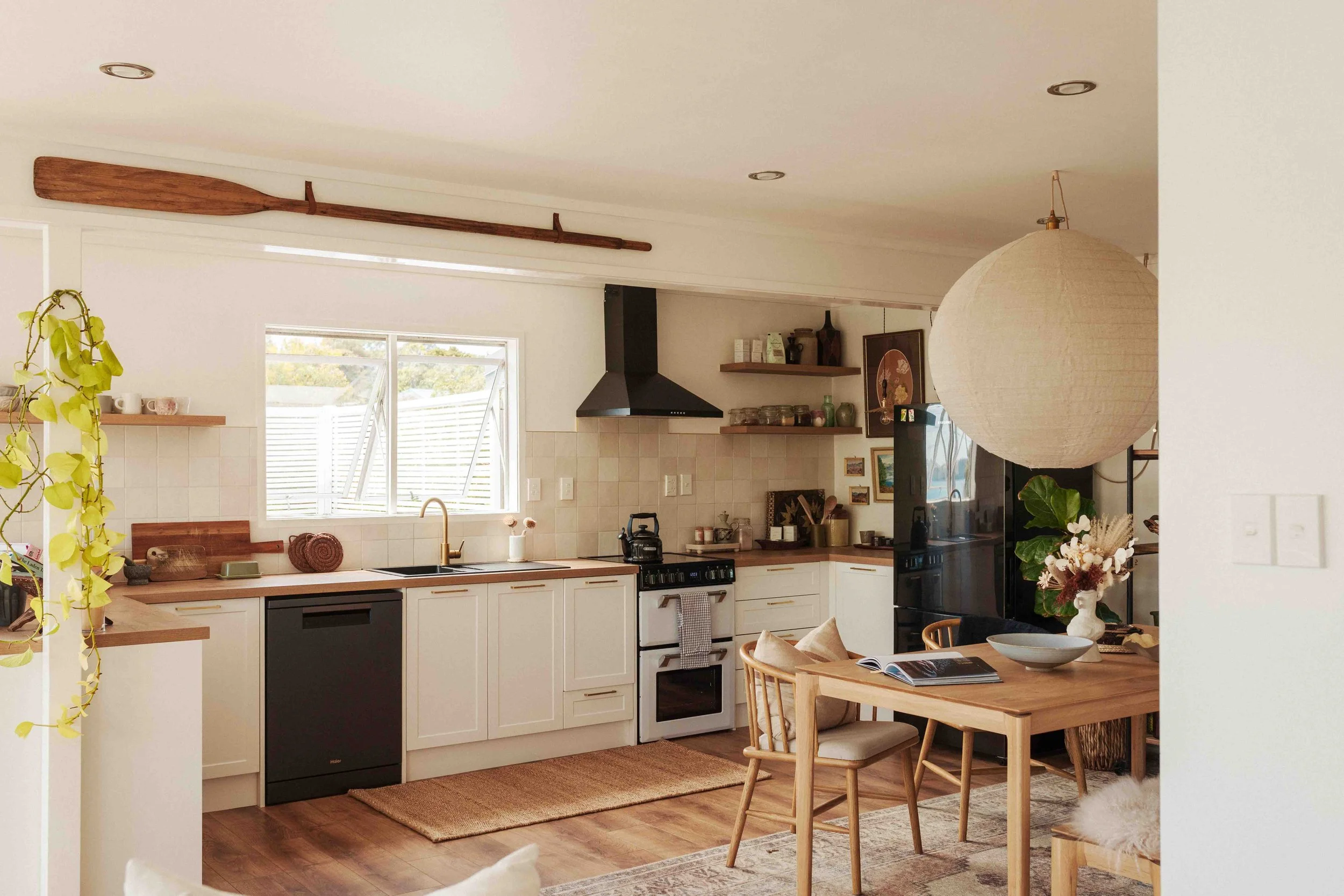
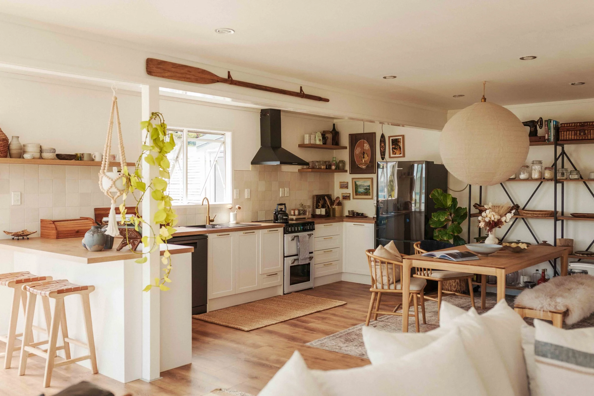
Initially, we chose to paint our living area a warm-toned white because it was the safer option and worked well with our furniture and decor. However, we found that the light walls made the space too bright, especially during the summer months when the glare from the sun would bounce off the walls and make the room far too warm. It needed grounding, and because the room got a lot of sunlight, we could get away with a darker colour.
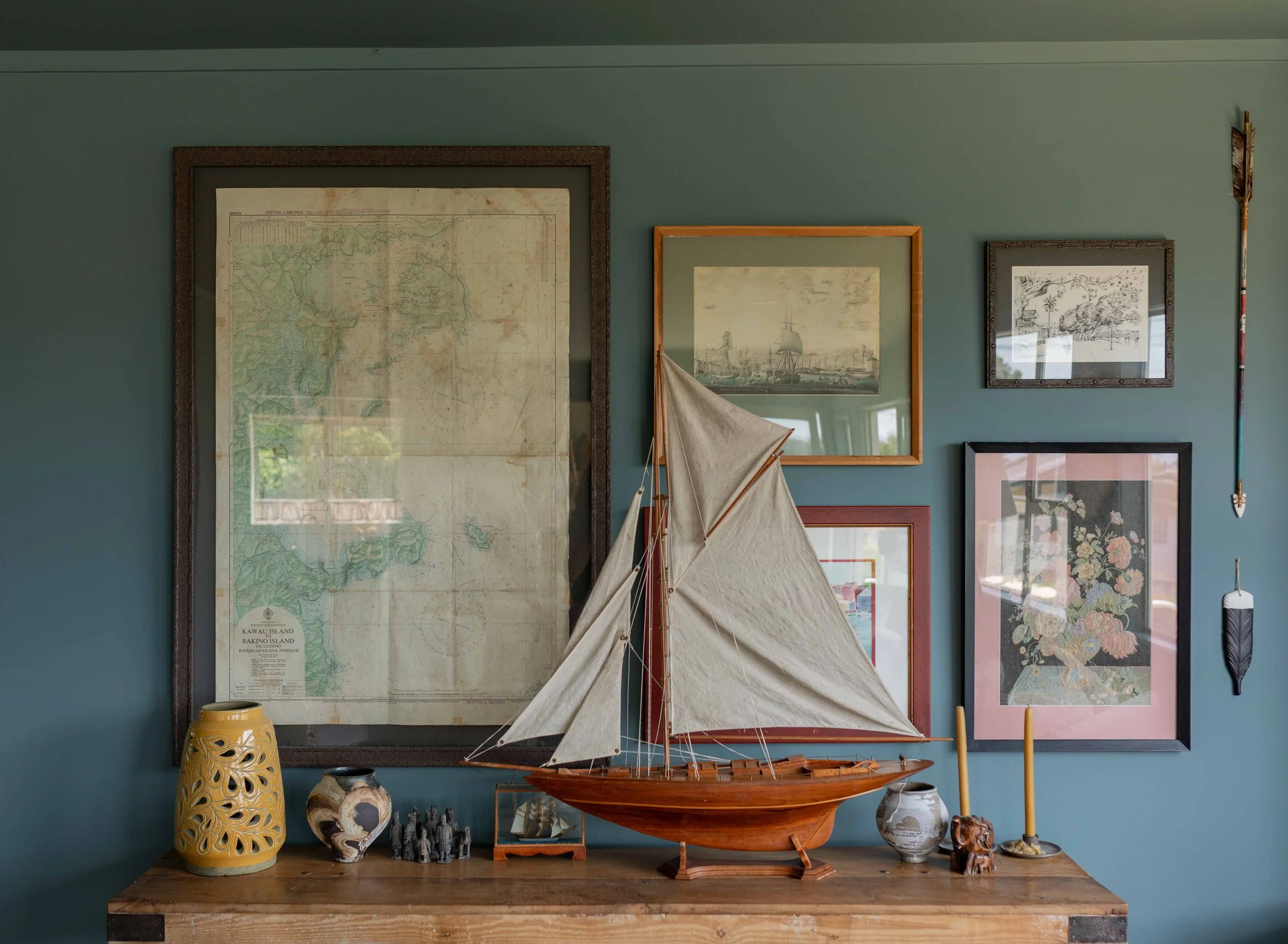
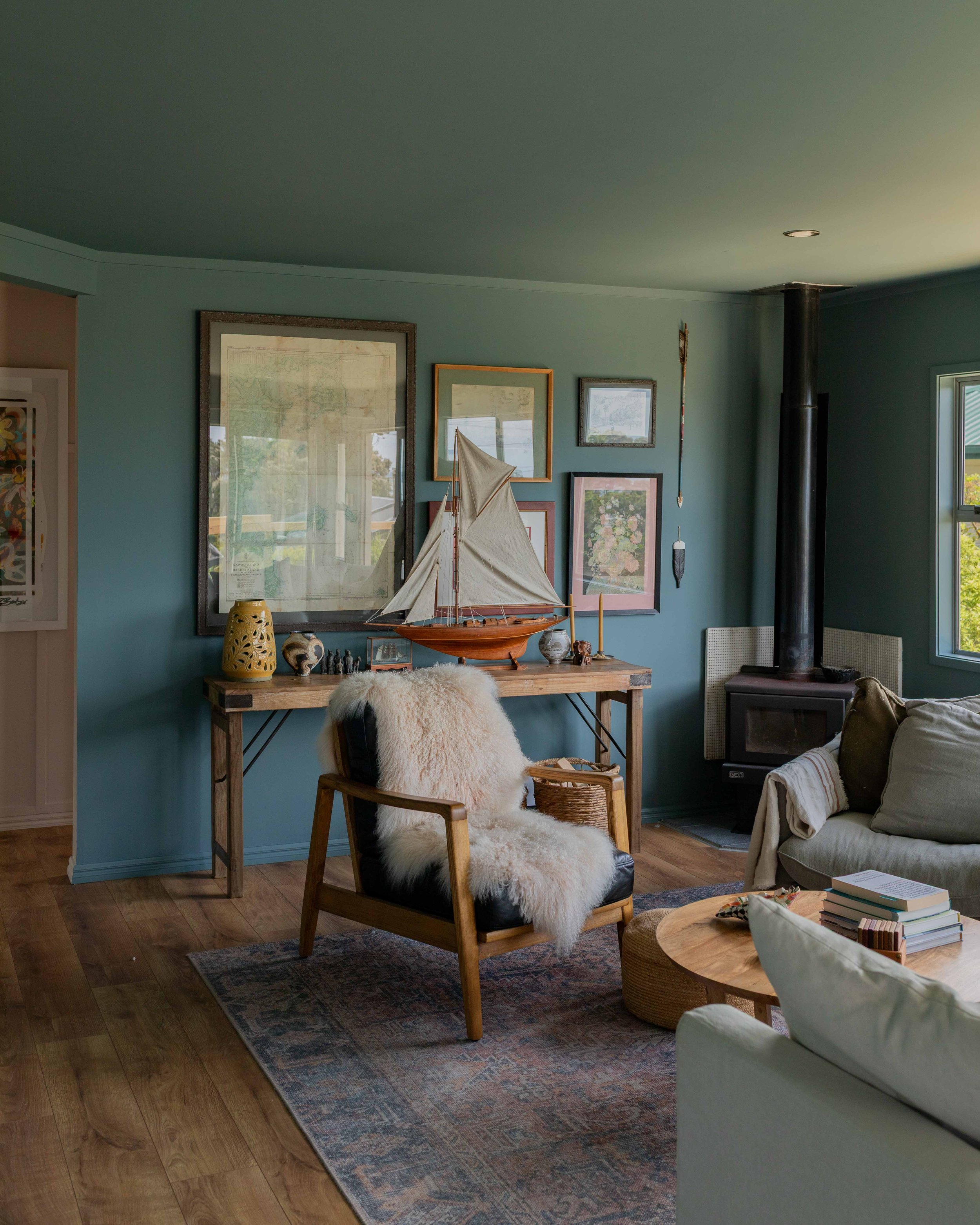
A blue hue felt fitting, especially with our view of Kawau Bay. After reaching out to aalto paint for colour recommendations, I found the perfect colour; shout out to colour consultant Anna, who mailed me several swatches and recommended ‘Perplex’ – our chosen colour and one we are obsessed with.
For this project, we turned to our favourite professional painters, better house painters who are amazing. Check out their work in my studio in this previous blog post. Here are the before and after photographs of the living/kitchen/dining space.
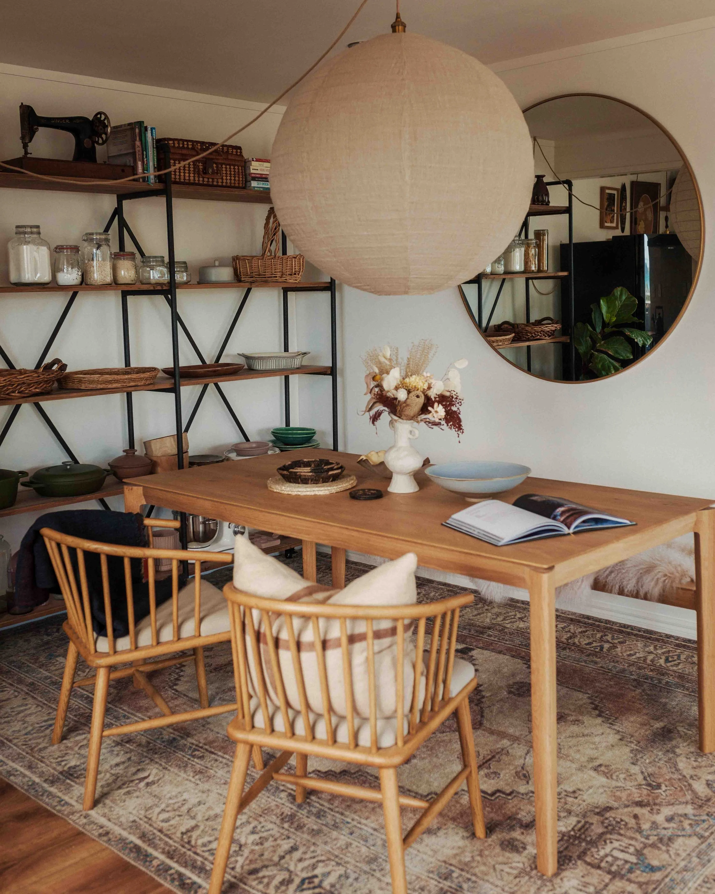
We also had the tile splash in the kitchen extended all the way up to just below the coving. I love how it makes the kitchen area look so much more spacious and ‘finished’. North Shore Tiling did a fantastic job with this project.
Before


After

In Ultimate Interior Matte
Paint Colour: Perplex by aalto paint

I love how the darker colour has added so much more personality and ‘vibe’ to the space.

Extending the kitchen backsplash tiles all the way to just below the coving added a sense of height to the room.


A darker colour highlights artwork on the walls and creates an overall cosy feeling.

Hi, hello!


Are we in love with our ‘new’ living space? 1000 times yes! We couldn’t be happier with how it all came together. Contrary to popular belief, darker colours (in a matt finish) can actually make a space feel/look more expansive, calmer, cosier and more elevated. Oftentimes, it’s just a matter of going all in 😜.